도입배경
협업을 하다 보면 팀원끼리 공유하는 컴퍼넌트가 생기게 된다. 이전 프로젝트에서는 git-issue에 사용법을 메모하는 형식으로 진행했는데, 이럴 경우 2가지 문제점이 생겼다.
- issue의 내용만 보고 이해하기도 힘들고, 상세히 쓰면 작성이 번거로움
- issue가 늘어나게 되면 해당 issue를 찾기가 힘듬
이때 component의 UI를 직접 확인할 수 있는 Storybook이라는 라이브러리를 알게 되서 도입하게 되었다.
그리고 이를 이번 프론트엔드 온보딩을 진행하면서 받은 간단한 todolist 페이지에 적용시켰다.
설치방법
1. 스토리북 설치
# Add Storybook:
npx storybook@latest init
우선 진행중이 프로젝트의 root 폴더에서 아래와 같은 명령어를 치면 된다.
그럴 경우 아래와 같은 폴더와 storybook예시 폴더가 생긴다.(저는 지웠습니다.)
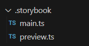
main.ts : 설정 파일로 각종 addon등을 확인할 있음
preview.ts : 미리보기를 설정하는 파일
2. tailwind를 위한 추가세팅
preview.ts는 미리보기를 설정해주는 파일이다. 하지만 아직 storybook에는 tailwind를 import하지 않은 상태다.
따라서 import 해주면 된다. (파일 이름은 다를 수 있다.)
import type { Preview } from '@storybook/react';
import '../src/tailwind.css'; // 이 줄 추가

const preview: Preview = {
  parameters: {
    actions: { argTypesRegex: '^on[A-Z].*' },
    controls: {
      matchers: {
        color: /(background|color)$/i,
        date: /Date$/i,
      },
    },
  },
};

export default preview;
이때 아래와 같은 기술스텍을 사용하는 경우에는 CSS를 compile할 때 추가적인 설정이 필요없지만,
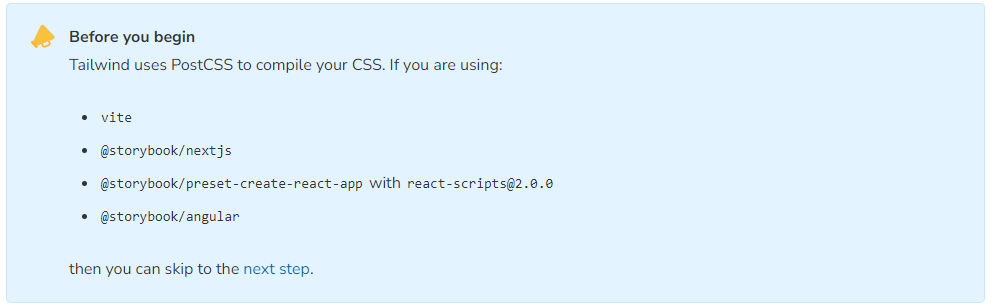
나는 CRA를 통해서 프로젝트를 생성했다.
이 경우는 아래 addon을 설치해야 한다.
npx storybook@latest add @storybook/addon-styling-webpack
이제 storybook을 사용할 수 있다.
//Button.tsx

type ButtonProps = {
  onClick: () => void;
  type: 'add' | 'delete';
};

function Button({ onClick, type }: ButtonProps) {
  const isAdd = type === 'add';
  const buttonClasses = `
  inline-block rounded border px-12 py-3 text-sm font-medium focus:outline-none focus:ring
  ${
    isAdd
      ? 'text-blue-500 hover:text-blue-700 border-blue-500 hover:border-blue-700'
      : 'text-red-500 hover:text-red-700 border-red-500 hover:border-red-700'
  }
`;

  return (
    <button onClick={onClick} className={buttonClasses}>
      {isAdd ? 'Add' : 'Delete'}
    </button>
  );
}

export default Button;
이번 프로젝트에서는 간단하게 todo 추가와 삭제할 수 있는 버튼만 존재한다.
따라서 외부에서 들어오는 type에 의해서 버튼이 2가지의 모양을 가지도록 하였다. (확장성 측면에선 좋지 못한 컴퍼넌트)
이를 활용해 만든 스토리북 컴퍼넌트는 아래와 같다.
//Button.stories.ts
import type { Meta, StoryObj } from '@storybook/react';

import Button from './Button';

const meta = {
  title: 'shared/Button',
  component: Button,
  parameters: {
    layout: 'centered',
  },
  tags: ['autodocs'],
  argTypes: {
    type: {
      control: {
        type: 'select',
        options: ['add', 'delete'],
      },
    },
  },
} satisfies Meta<typeof Button>;

export default meta;
type Story = StoryObj<typeof meta>;

// More on writing stories with args: https://storybook.js.org/docs/writing-stories/args
export const TypeButton: Story = {
  args: {
    onClick: () => {
      console.log('정상 작동');
    },
    type: 'add',
  },
};
그리고 npm run storybook 명령어를 치면 6006포트에서 컴퍼넌트들을 확인할 수 있다.
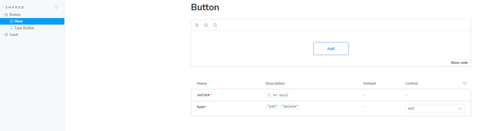
그리고 select형식으로 add와 type을 고를 수 있다.

이제 내가 작성한 stories 파일을 해석해보겠다.
이때 meta는 storybook에서 해당 컴퍼넌트를 어떻게 보여줄 지 설정하는 것이고, 이를 바탕으로 TypeButton과 같은 초기 값이 주어진 버튼을 만들 수 있다.
const meta = {
  title: 'shared/Button',
  component: Button,
  parameters: {
    layout: 'centered',
  },
  tags: ['autodocs'],
  argTypes: {
    type: {
      control: {
        type: 'select',
        options: ['add', 'delete'],
      },
    },
  },
} satisfies Meta<typeof Button>;
각각에 대해 설명하자면
- title : storybook에서 해당 컴퍼넌트의 위치
- component : 어떤 컴퍼넌트인지 (내가 만든 Button 컴퍼넌트이다)
- parameters : storybook에서 메타데이터와 같은 역할을 한다.
이 중에서 layout 옵션은 화면에 어떻게 보일지인데, 여기서 centered 옵션을 줘서 버튼이 스토리북에서 페이지 가운데 존 재한다. - tags : autodocs 옵션을 줘서 자동으로 문서가 생기게 했다.
이때 tags를 사용하지 않고, mdx파일을 만들어서 문서를 만드는 방법도 있다. - argTypes : storybook에서 해당 컴퍼넌트 어떤 매개변수 값을 조절할 수 있게 할 지 설정할 수 있다.
나는 type이라는 props에 대해서 add와 delete 중 하나로 select할 수 있또록 설정하였다.
'프론트엔드' 카테고리의 다른 글
| Three.js 튜토리얼 - 기본 구조와 사용 방법 (0) | 2024.04.10 |
|---|---|
| (React)컴파운드 패턴으로 드롭다운 컴퍼넌트 만들기-1 구현하기 (0) | 2024.03.28 |
| DOM과 Virtual DOM (0) | 2024.02.22 |
| Yarn Berry PnP를 NPM대신 사용하면 좋은 이유 (0) | 2023.11.20 |
| react query v4 로 무한스크롤 구현하기+ 설명 (useInfinity Scroll) (0) | 2023.10.26 |